Recently Mojo Helpdesk has implements a few minor changes. Here is one you might have missed.
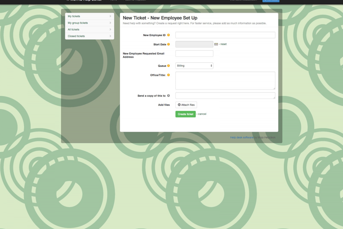
Previously, when creating a ticket, the field labels were located to the left of the text box. This minimized the visible text space, which would cause text wrapping.
Now, we have changed the labels to be place above the text box. This allows users to keep track of more content that they have entered and better describe the issue that they are in need of assistance with.
Details do matter and here at Mojo Helpdesk each detail adds up to a better support system for you.


